Notes · Journal ·
Logbook 2026-10-10
Today I started working on the brand of my personal website. The site itself would come later: a place to publish notes and articles, show some work and experiments, and say what I’m doing now. First, I wanted the identity it would live in.
I chose to do this work in Claude Design, on purpose. I wanted to give Claude and myself a canvas to work on together.
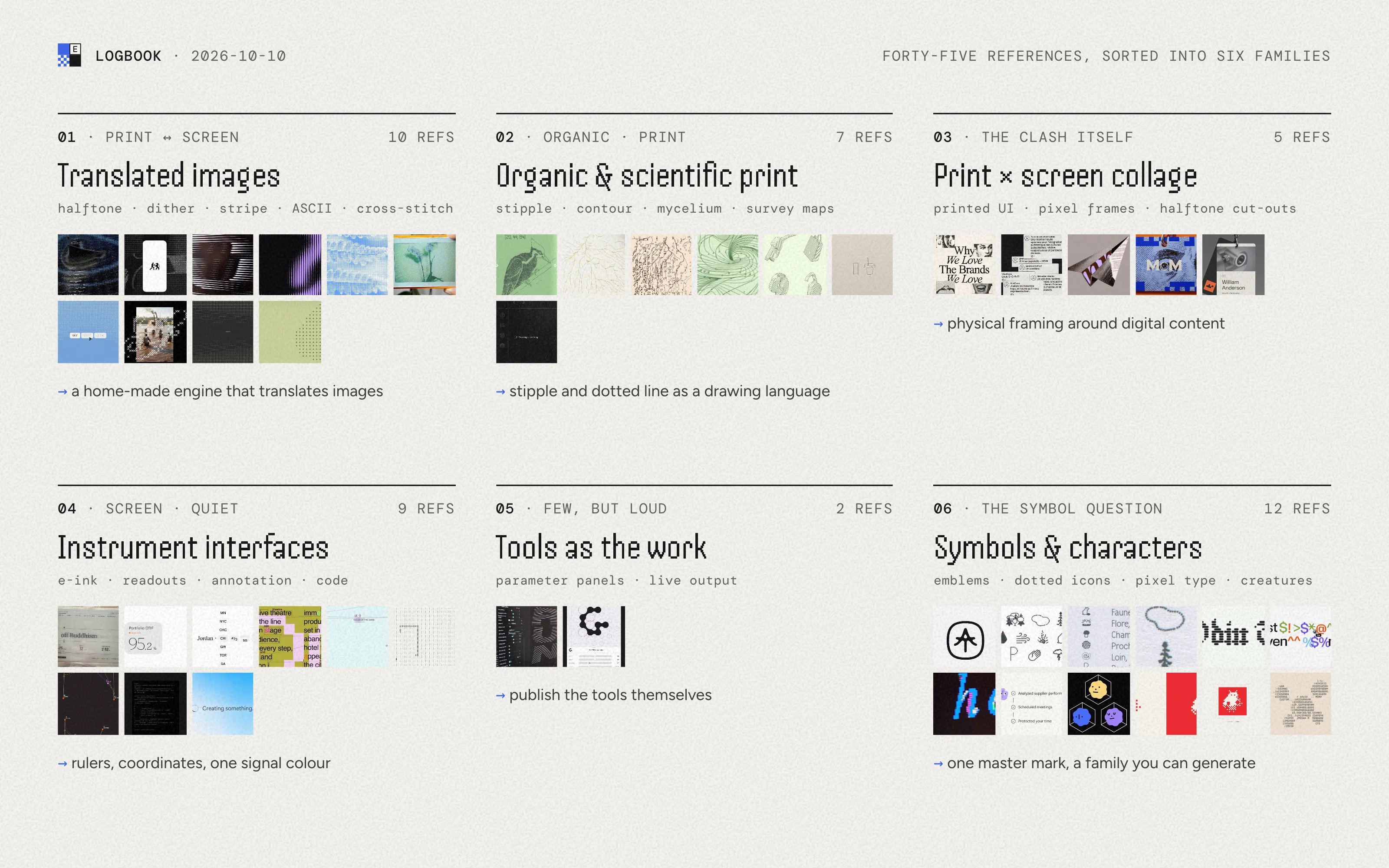
Over time I had collected visual references, around forty-five images and videos, and gathering them beforehand turned out to be essential. I didn’t want to start by making anything. I asked for the references to be analysed and sorted first, and for a description of the direction they pointed to and what it could feel like, with one to three possible directions to weigh at the end.
I added a few intentions. I like the clash between organic, printed things and pixels and screens. I’d like mostly shades of grey, with a few vivid colours kept for accents and images. I want custom tools, built along the way, that generate iconography, dithered or pixelated visuals, textures and patterns. And I want a symbol to represent me, one that can grow into a whole family of symbols.
The first answer sorted the references into six families: translated images, organic and scientific print, print and screen collage, instrument interfaces, tools as the work, and symbols and characters. Each came with a short reading and what I could take from it. That’s something I liked in working with AI: its ability to cross and consolidate ideas, and to put words on the visuals I had collected. It brought out things I hadn’t necessarily been aware of.
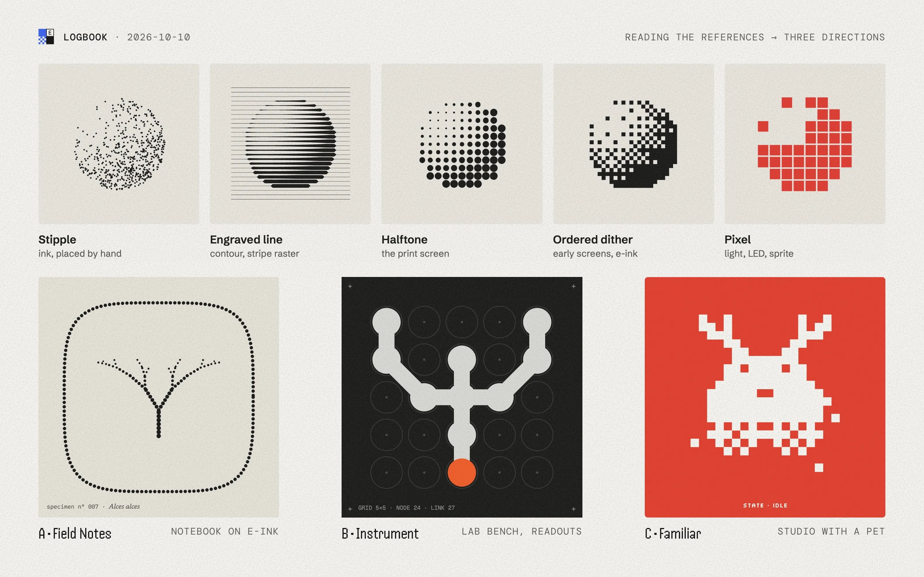
The reading that came back summed up the references in one idea: paper and light, joined by a dot. A stipple dot, a halftone dot, a pixel and an LED are the same unit at different resolutions. It also pulled a thread from my handle. elchdl is a short version of my full name, and Elch is German for elk. Antlers branch like several things in my references, so the elk became the seed of the symbol.
Three directions came out of it, side by side on a shared canvas. “Field Notes”, a naturalist’s notebook read on an e-ink screen. “Instrument”, a quiet lab bench where every piece of work has its readout. “Familiar”, a bare studio with a pixel elk as a pet. Nothing was chosen yet. The same day, I created the site’s repository, with a single line in its README: Ed’s online space.