Notes · Journal ·
Logbook 2026-11-01
Today the site went live.
I spent the afternoon reviewing the landing page in detail before merging it. The main illustration had to take more room and belong to the page, instead of sitting in a frame like a picture, with cells two to three times bigger so you can actually tell them apart. The cup became the main image for a start, alive, building itself as the page loads. Next to it, a short text to say hello and who I am. I wanted a light and a dark version right away, with a three-way switch: light, system, dark. At the bottom, the cell pattern now runs along the edge of the page, across its full width, under a small “elchdl · 2026”.
Some choices went back and forth. The separators changed colour, then changed back. A large fluid wordmark moved from the top of the page to the footer, then disappeared. One thing I settled for good: the cell size, 16 pixels. It’s a good balance for the eye, and the shape the illustration represents stays easy to read. It’s now the default everywhere.
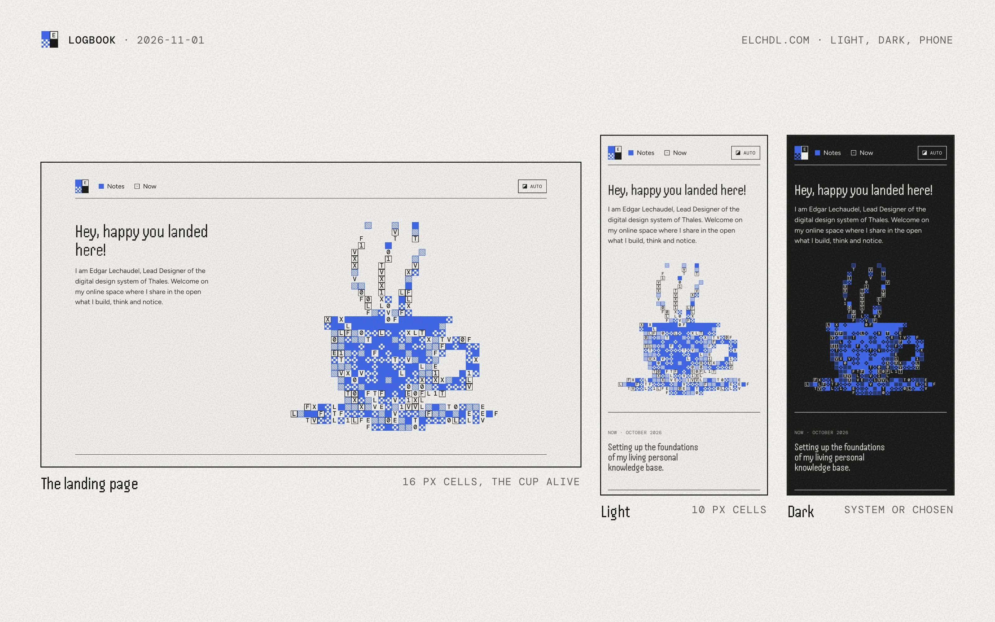
Once the pull request was merged, elchdl.com showed the landing page. I moved straight on to the Notes section, starting with the logbook entries already published from my knowledge base. I’ll also write some entries directly on the site, so the two sources must never collide. Entries from the knowledge base get a tag, and a short banner giving the context of the project.
Two smaller things closed the day. Handjet looked less clean at small sizes, so we tried aligning it to its own grid. It came out thinner, with big jumps in weight between sizes, and I preferred it as before, slightly heavier. And the Now section gained a memory: each update is kept with its date, so the history can be read in order, and a Now page lists them.