Notes · Journal ·
Logbook 2026-11-08
Today the Lab opened, with a first experiment: The Dice.
It started late last night with the quotes. Until then, a quote had no page of its own: clicking it led out to its source. Now each one has its page, the words in Handjet on a single screen, with cells growing from the bottom-right corner as on the slides. Clicking a quote in the Feed, on the landing or in the Notes opens it there, and Copy link and Share give its address.
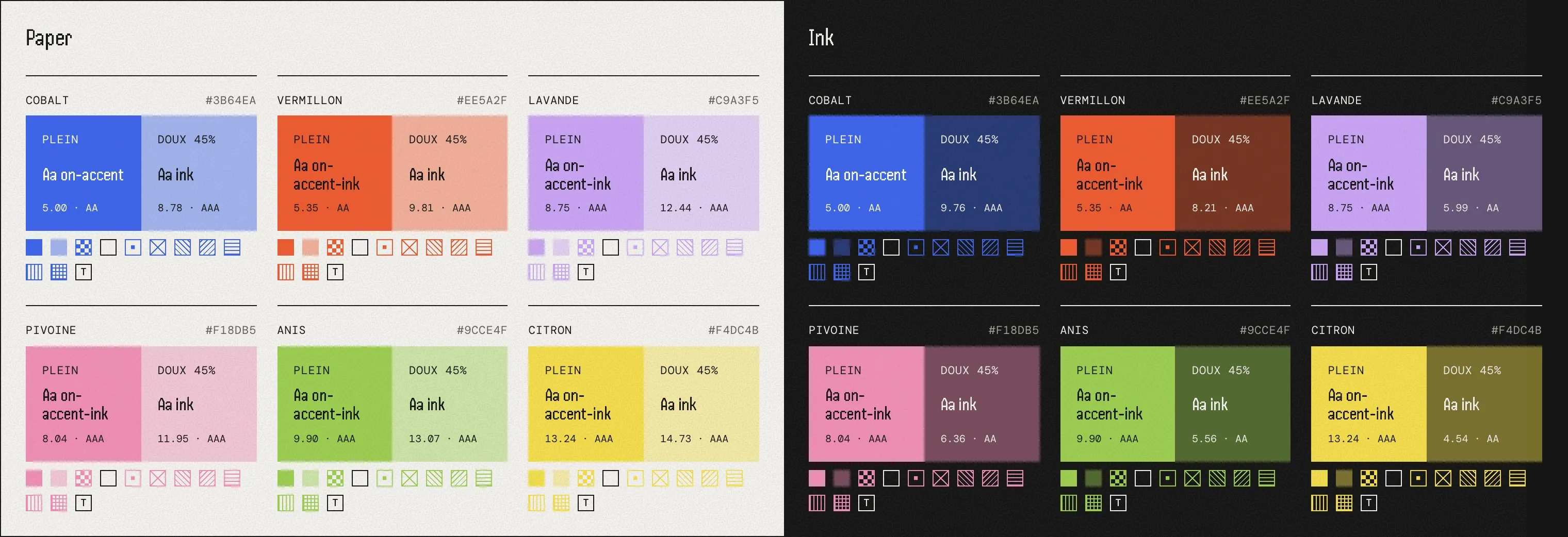
This morning I went back to the accent colours. Next to cobalt, the visual direction had left four accents that the site barely used. I gathered references from print, risograph prints, posters and editorial cards, and picked a set from them: vermillon, lavande, pivoine, anis and citron, the names of inks. Cobalt stays the main accent, and vermillon keeps alerts and new things. The four others have no role: a place of the site, a Lab experiment or an object picks one and keeps it for good. On ink, cobalt was too dark to read as a link, so I lifted it to #4D7AFF, keeping its hue and saturation.
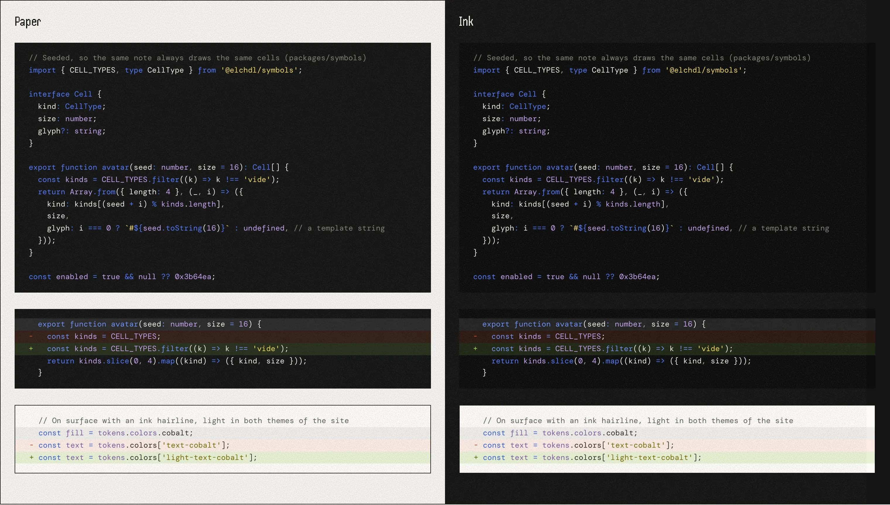
The code blocks came next. Notes still used Astro’s default theme, and the slides had their own copy of the colours. Both now share a single Shiki theme built from the tokens: dark by default, light when a block or a page asks for it. Lines added or removed get a + or a − along with their colour, so a change never rests on colour alone. I measured every text run on the test page, and the lowest contrast is 4.57:1.
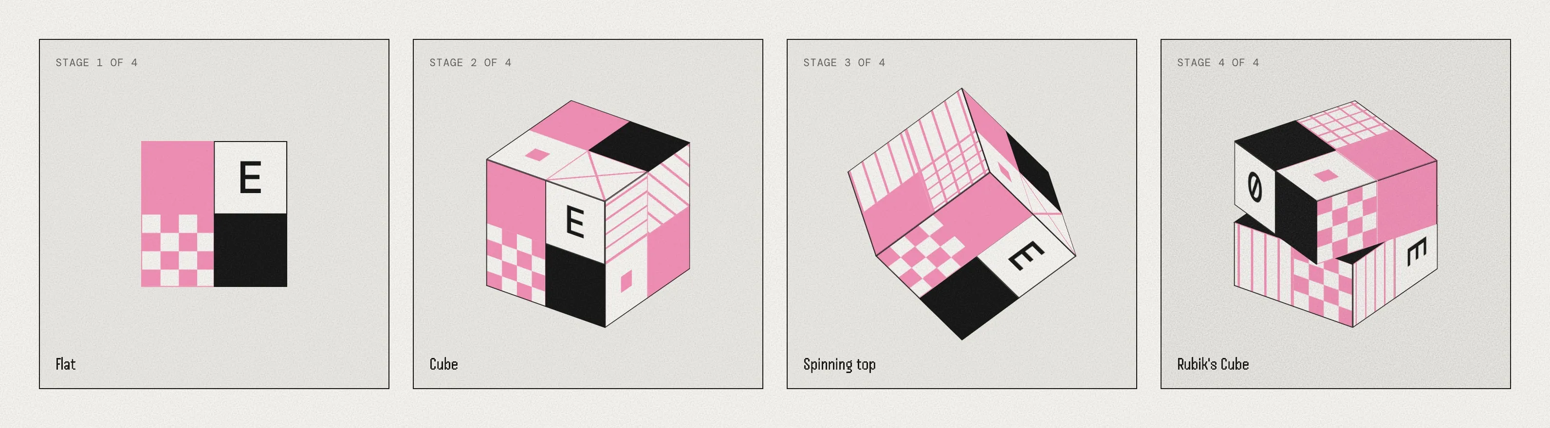
Then the Lab. The Dice comes from an idea I had during the work on the visual direction: a die with an avatar on each face, which stayed on the canvas as an alternative to the mascot. The experiment picks it up from the logomark in the header and takes it through four stages: flat, a cube, a spinning top, then a Rubik’s Cube that shuffles its cells and turns back until the logo comes out whole. The cells are the site’s own, patterns in CSS and glyphs in DM Mono. The Dice took pivoine as its colour, and it has a card on /lab/, a post in the Feed with a loop, and its own share image.
Playing with it gave me two ideas for using the die on the site. The first is an easter egg on the site’s main logomark. The second is a Random button that rolls the die, then suggests a random piece of the site to read.