The Focus Reader
Between 10 October and 1 November, this site got its visual identity: square cells, a small avatar for a logo, illustrations drawn by a tool, a mascot, three typefaces and a file that writes it all down. The logbook told it one day at a time. Here I step back and tell the whole arc, and above all how I worked, more than what came out.
I did most of it with Claude, in Claude Design, on one shared canvas. What I want to keep from those three weeks is less the result than the order of the steps, and where my own judgment came in.
Collecting before making
It started long before 10 October. Over time I had kept around forty-five references, images and videos: screenshots, photos, screen recordings, anything that caught my eye.
Gathering them before starting turned out to be essential. Every round afterwards went back to them, and each time they gave the conversation something concrete to stand on.
As a whole, they pulled in a few directions at once. Paper and screens. Print and pixels. Organic shapes and digital grids. Mostly greys, with rare, loud colours. Quiet interfaces next to tools that show their machinery. No single reference held the answer: the tensions between them were the brief.
An aim before any image
On the first day, I didn’t ask for anything to be made. I asked for the references to be analysed and sorted first, for a description of the direction they pointed to and what it could feel like, and for one to three directions to weigh only at the end. “Take your time on this initial task, deep work.”
I added four intentions, the closest thing I had to a vision:
- the clash, or the meeting, of organic and printed things with pixels and screens;
- mostly shades of grey, with a few vivid colours kept for accents and images;
- home-made tools, built along the way, to generate icons, textures, patterns and dithered or pixelated visuals;
- a symbol to represent me, able to grow into a whole family.
Most of what the site looks like today traces back to one of those lines: cells where paper meets pixels, greys with a single main accent, an illustration tool built along the way, and a 2×2 avatar that comes in endless variations.
Sorting on a shared canvas
I chose Claude Design on purpose: I wanted a canvas that Claude and I would both work on. Each round became a row of boards, and the rows piled up into one large map of the whole exploration, from the first reading to the last corrections.
The first board sorted the references into six families: translated images, organic and scientific print, print and screen collage, instrument interfaces, tools as the work, and symbols and characters. Each family came with a few keywords and a short line on what I could take from it.
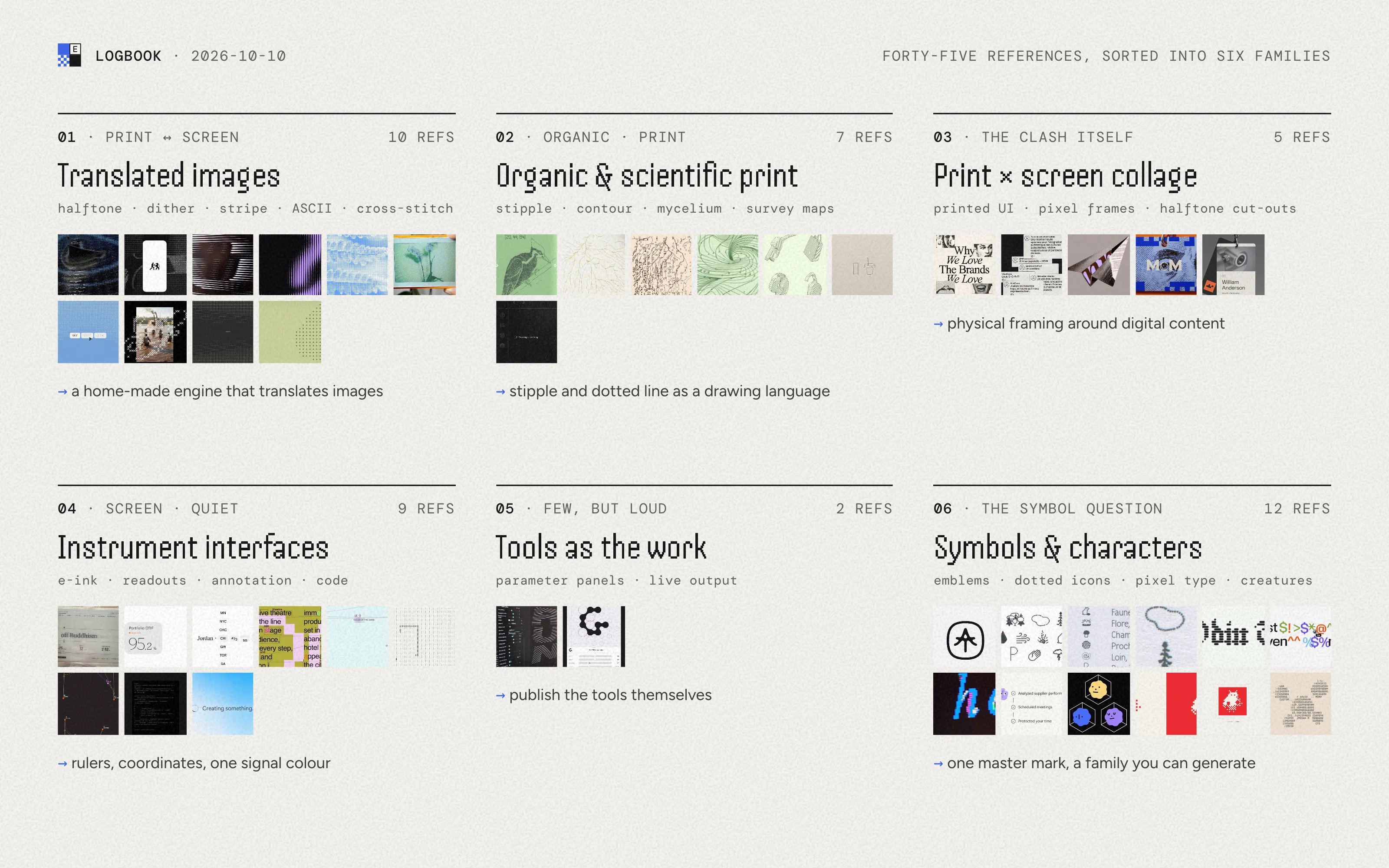
That’s something I liked in working with AI: its ability to cross and consolidate ideas, and to put words on visuals I had collected without always knowing why. It brought out things I hadn’t been fully aware of. I had picked those images one by one, over time. Seen together and named, they started to make a direction.
Words for what I had collected
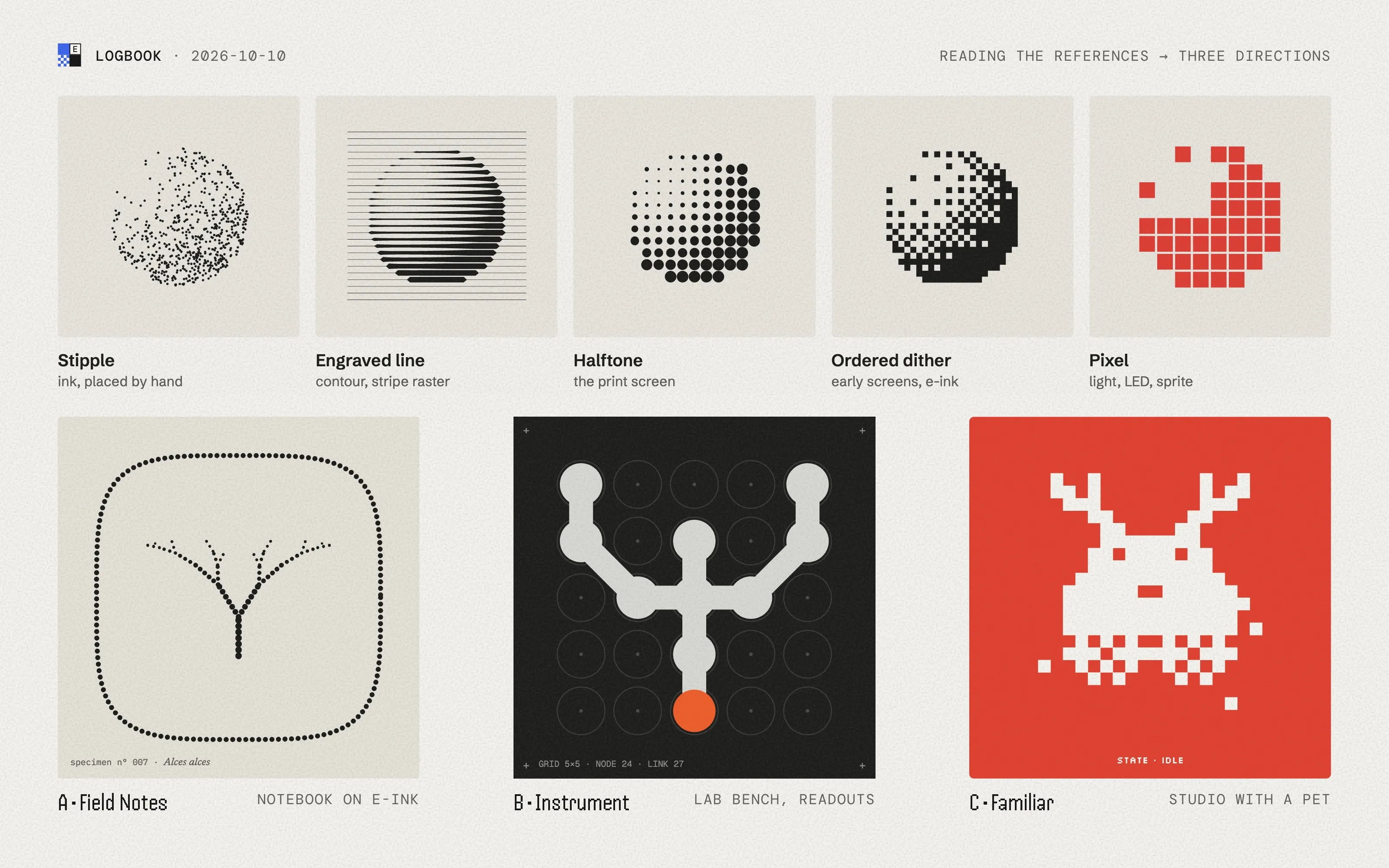
The reading came back with one idea: paper and light, joined by a dot. A stipple dot, a halftone dot, a pixel and an LED are the same unit at different resolutions. It was shown as one sphere drawn in five materials, from stipple to pixel.
Around that idea came a small vocabulary: images always translated before being shown, grey that talks and colour that signals, visible machinery, things ordered like a catalogue, characters that get their personality from two eyes, surfaces with matter. Discussing those words was part of the work, as much as looking at the boards. They became the shared language for every round that followed, and a way to say “yes, that” or “not that” without drawing anything.
The vocabulary also pulled a thread from my handle. elchdl is a short version of my full name, and Elch is German for elk. Antlers branch like several things in the references, so the elk became the seed of the symbol. It stayed for a week, left, and came back later as one object among others. The cup took its place as the main image.
Three directions came out of that first day, side by side on the canvas: “Field Notes”, a naturalist’s notebook read on an e-ink screen; “Instrument”, a quiet lab bench where every piece of work has its readout; “Familiar”, a bare studio with a pixel pet. I didn’t choose that day.
Too many leads
On 16 October I answered. I liked the structure of one direction, the character of another, and the textures of the third, so I asked for them merged. The merge came back as “an instrument with a familiar inside”, and I kept iterating that same night: more of a typeface I had forgotten to share, a green in the palette, pixel icons, an elk less generic, a compact mascot.
By the evening I could feel it: we had fused too many leads together. Every round added something and nothing left. So I asked to start over, with a direction that combines fewer things. Two ideas had to stay, an animated symbol and a pattern engine. For the rest, I didn’t describe anything. I went back over the canvas and left comments on what still caught my eye, pinned to precise elements of earlier boards.
That was the turn in the method. A comment on a precise element replaced a long description: pointing at a grain, a type pairing or a way of labelling things says more than a paragraph about them. What I didn’t point at was parked, not thrown away. It mattered later: the typeface I had set aside that night came back a week afterwards, in the lead.
Narrowing down
The next turn came past midnight, and it came from paper. In my notebook I had sketched rectangles that could hold symbols, with two pieces only: a square and a vertical bar. I asked to drop the elk and work from that sketch.
The first result spelled my initials and had a mascot made of a letter lying on its side. Seeing it, I narrowed again, in one message. Forget the initials. Leave the mascot aside for now. Focus on interface elements and animated illustrations. Drop two of the shapes. Use real glyphs from a monospaced typeface instead of drawn ones. And let the pattern tool draw real objects, from coloured shapes and glyphs, a principle several ASCII pieces among the references share.
What came back is the direction I’m still in: a family of square cells, solid, checkered, hatched, outlined or holding a mono glyph; a small tool that draws objects with them and brings them to life; and first interface pieces made of the same cells. Most of what had been tried before was gone. When I came back to it a few days later, I was very much a fan.
One piece at a time
Once the cells were there, I stopped exploring the whole and worked on one piece of the system at a time. Each piece got its own board and its own rounds of comments.
- The logo. It didn’t need to be the site’s name: the small 2×2 avatars made of cells, already used on cards, could do the job (22 October).
- The illustrations. Objects drawn in cells by a tool, from a seed, that can build themselves up or stay alive with steam and leaves moving. The elk came back here, as an object. Over photos, the cells stay in a few corners and spread organically, without covering the picture.
- The type. A round of its own, comparing shortlists in context, until a trio: Handjet for titles, Figtree for interface and text, DM Mono for data and for the glyphs inside the cells. Handjet, set aside a week earlier, was back in the lead.
- The mascot. A rotating die first, too realistic, then sober, then set aside for a simpler idea: four cells in a square. A whole morning went into its motion on 23 October: the state told by where the cells are, one cell hiding behind a neighbour, one movement at a time, still at rest so it doesn’t distract.
Each board held one question at a time, so each round of comments could stay on it.
Writing it down
On 30 October, after two last corrections on the canvas, I wanted the direction written down: a DESIGN.md file, one document to feed as the work goes on. The most advanced format I found for this kind of file is still an alpha: tokens at the top, then prose saying when and why to use them.
From there the exploration moved to the site’s repository, foundations first. The design tokens are generated from DESIGN.md. The cells and the mascot became reusable components. The illustration tool came along, kept private. The canvas stays where I explore; the file is what the code follows.
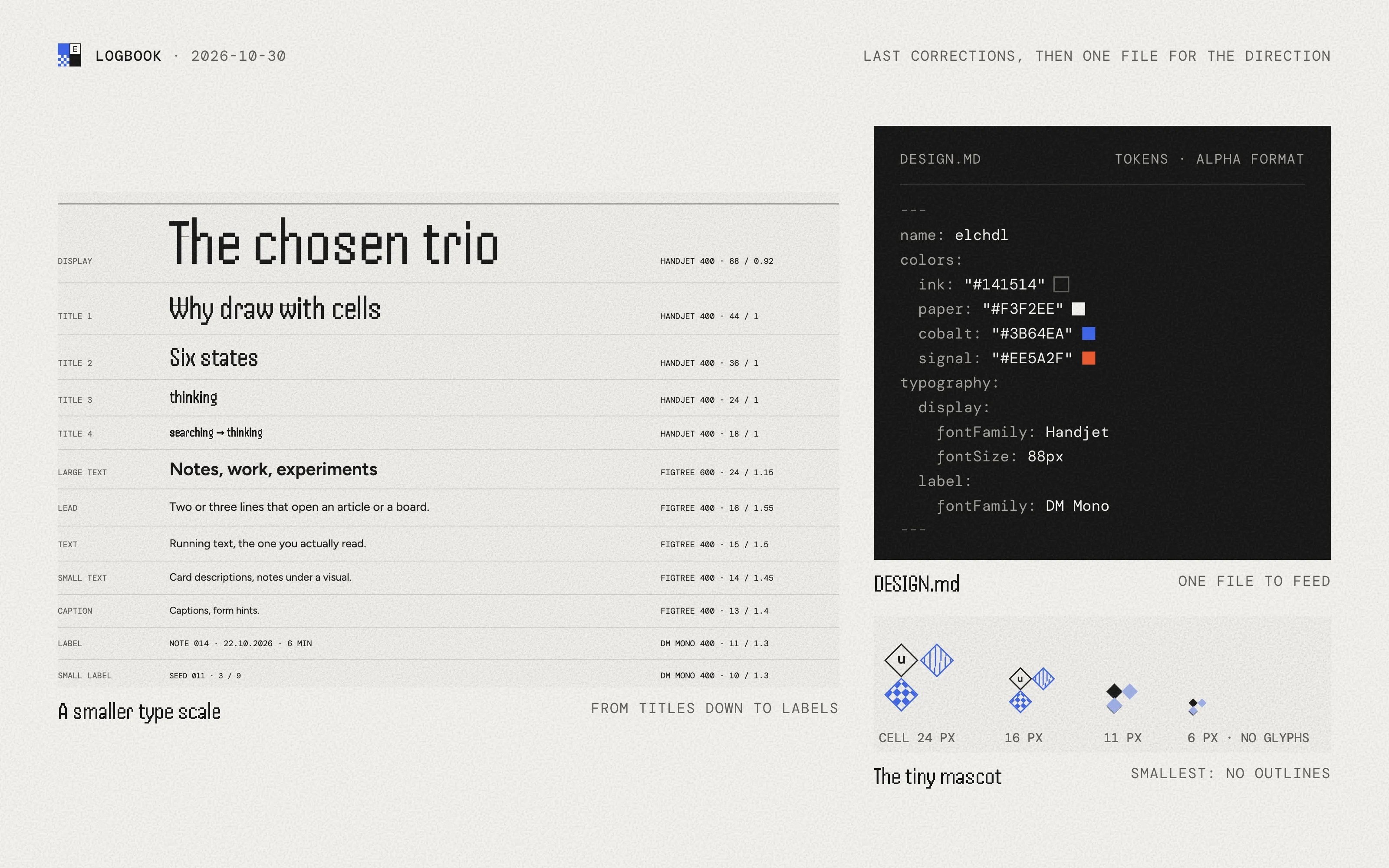
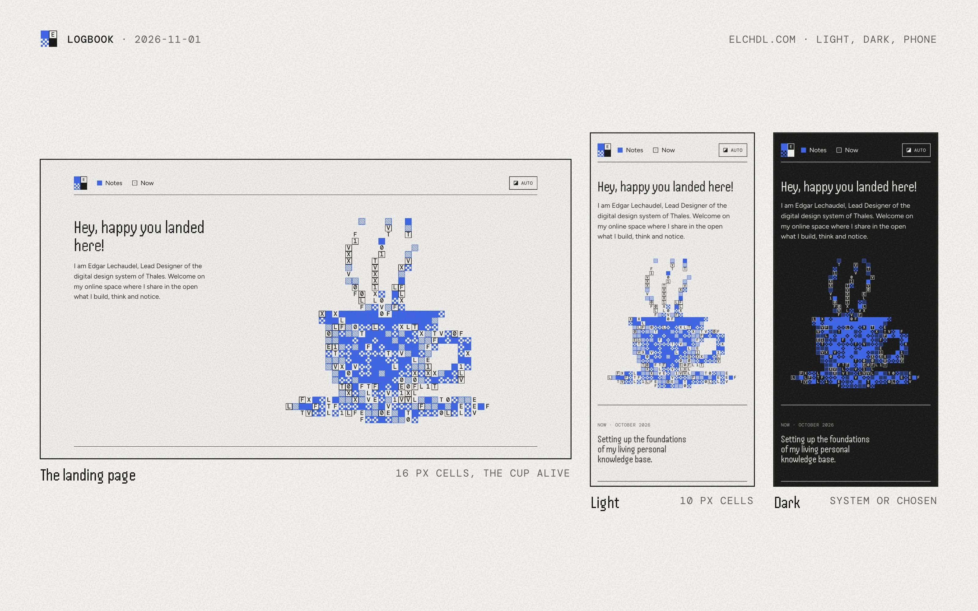
The landing page took one more day of review before going live on 1 November. The cup became the main image, alive, building itself as the page loads, with cells big enough to tell apart. The cell size settled at 16 pixels, a good balance for the eye, and became the default everywhere.
Back to the organic side
A week after launch, I came back to the colours. The four secondary accents picked on the canvas were barely used, and the open question on palette tracks was still in DESIGN.md. This time I brought new inspiration, colours from print inks, to lean closer to the organic side of the site: nature, more than digital.
The method was the same, on a smaller scale: references first, then the new colours matched with what already existed, side by side on paper and on ink, with the grain. Cobalt stayed the main accent and the only deep one. The others became light print-ink tones, named after a pigment, two flowers, a seed and a fruit: Vermillon, Lavande, Pivoine, Anis and Citron. Each got a deeper shade for text, so it stays readable in both themes.
What I take from it
References gathered upfront were the foundation. They gave every round something to come back to, and when I reworked the colours after launch, I started with references again.
AI was good at crossing ideas, consolidating them, and naming what I had collected. For me, the words it produced were worth discussing on their own: they turned a pile of images into a vocabulary I could steer with.
The canvas made the method possible. Every proposal and its iterations sat side by side; I could add, arrange or draw something to feed the thinking; and feedback went in a comment on a precise element instead of a long description.
And there’s an idea I had noted in my knowledge base before starting: taste as judgment built through correction. It proved true more than once. It took a lot of initial material, and many leads on the table, to set aside the ones that weren’t relevant and dig into the ones with potential. Starting over on 16 October wasn’t a failure of the process. It was the process.
Since 2 November the direction grows through use, on the site itself, more than on the canvas. What I haven’t settled yet is how much of this method carries over once the direction lives in code, and the next correction happens in a pull request rather than in a comment on a board.
In 2021 I published cmdncmds, one issue a week. Each issue gathered a few quotes I had kept, each followed by my own comment. Over the year that made 52 issues, 129 comments and one longer essay: about 20,000 words of mine.
I hadn’t read them in years. This week I went through all of them again, to write down how I write on this site, as I told in the logbook. What I didn’t expect was to find, in those old comments, so many of the threads I’m pulling today.
What I set aside
I’ve been logging for a long time. Quotes kept, links clipped, notes, comments, logbook entries: everything I set aside or write as a trace of my interests, my positions and my reflections.
More than four years of notes in Obsidian, and two years of web clips. The habit was real, but I never had a routine solid enough to come back to it, and in the end the whole thing froze under its own accumulation. For years, all that material was a dormant load.
Rereading cmdncmds was the same kind of material, seen from five years away. And this time it didn’t stay dormant.
The threads
Here is what I found, with the 2021 text on one side and what I’m building now on the other.
- Reading beyond my feeds. In issue 40 I listed what I did to get out of the mainstream feeds: a collection of small blogs in my RSS reader, and a habit I summed up as “search more, browse less”. Today my personal knowledge base reads my feeds and newsletters for me, and produces personalised reviews based on my interests and my feedback. It’s built to learn from me over time.
- Taking notes to use them. In issue 35 I wrote that journaling and taking notes was the best way to recall and build on past thoughts. The notes piled up, unused. The knowledge base I started on 26 October is the version where they finally get used.
- Sharing work in progress. In issue 11 and issue 36 I wrote about how much more there is to learn when you share early, and how slowly I was learning it. This site has a logbook, built out in the open, one working day at a time. It also brings a bit of gamification to growing these projects, and to publishing what matters to me, here and now.
- The smallest step. Divide and conquer came up in issue 6, when I was learning to code, then in issue 18 and issue 32. This autumn, the first build session of the knowledge base kept things deliberately small, I tried the triage on a small sample before letting it sort everything, and the site moved to its repository starting with the foundations rather than everything at once.
- A hobbyist developer. In issue 34 I called myself “a recreative developer”. I was self-taught long before AI. What changed is that AI coding tools pushed my ambitions past what used to limit me.
- A generalist. In issue 52 I wrote that I felt like a generalist, and that skills from different fields connect in unexpected ways. That thread runs through everything I do now. I can build this knowledge base with AI because I know how to use the tools, and this website because I know the code. And all of it feeds my work on design systems, and my thinking on the role of AI in our jobs, and beyond. Having such varied interests is what makes it possible: many dots connect with each other, and bring targeted results, but also unexpected ones. Serendipity.
- Writing more, talking less. In Is work working?, the essay of issue 47, I wrote about remote work and the meetings that end with “let’s meet again with more substance”. What I took from it then: write more, talk less, and share things sooner. Today my projects run on written issues, briefs and decisions.
Seeing those old texts reconnect to the present, with clear links to what I’m doing now, was funny, and comforting. It’s easy to forget what you once wrote. When it still makes sense, it gives a sense of alignment. Where I no longer agree, I can see how I’ve changed.
From dormant load to asset
Logging everything used to be a dormant load. With AI as the go-between, it becomes an invaluable asset: it can make connections I never had the time to make, and the better it understands me, the more useful it is, right now.
This isn’t a promise. It’s the small system already in place. The logbook of this site started on 10 October, the knowledge base on 26 October, and the site went live on 1 November. On 29 October, the knowledge base took in its first batch: more than a hundred Safari tabs, a handful of feeds and about sixty newsletters, and seven themes came out of what that batch actually contained. I could never have imagined launching this, and producing what we have, in so little time.
Keeping the ideas mine
There’s a tension in this, and I’d rather say it. An AI that understands me better also ends up shaping what I read.
I accept it, for a few reasons. I decide what goes in: the RSS feeds, the newsletters, the specific links I send. I couldn’t process all of it myself anyway. And I keep an eye on what comes out. When I see an interesting article title, or read an article with a potential quote, I check whether the system surfaced it on its own. If it didn’t, I give it the information, so it keeps refining.
Delegating doesn’t mean reading less. I won’t stop reading what I come across and what sparks my curiosity. On the contrary, I can now do it without having to choose. I want everything else processed, because it lets me spot weak signals more easily, and make stronger, better argued links between the opinions I form myself and what the AI brings up.
I want AI to help me write, not to think for me. Katie Parrott describes the risk well in How I Escaped AI Autopilot: polished output looks finished, and we easily take it for correct. Matt Ström-Awn finds the same trap in code review: asking whether the code looks good instead of whether it does what we want. I turned Katie Parrott’s first answer, think before you look, into the way I start every article, as I told in the logbook: an almost maieutic exchange, where the AI asks and what I think comes out of me. This article started that way.
Its understanding of me is a long-term goal, not something it has. If I want AI to work well for me later, I have to tune it now, and keep my critical thinking and my authority along the way.
The method, since 2021
Looking back, Is work working? was more than an essay about remote work. I had collected highlights on the same topic over several weeks, and wrote what I called “a note for thoughts” to go through all of them. Without naming it, I was following a method I want to keep: collect, observe, note, connect, and distil the essence into an article, with its sources linked and quoted.
That’s what the knowledge base and this site are built to carry on. The knowledge base collects, helps me observe and note, and brings up connections I wouldn’t have had the time to make. Which ones hold, and the essence I draw from them, stay mine. This article is the method applied to my own past: what I had set aside in 2021, connected to what I’m building now.
Logging everything was a dormant load for years. Seen through these threads, it was also a way of getting to know what I care about. With AI as the go-between, I can finally do something with it, and push my ambitions past what used to limit me.
On 7 November I kept a quote from Sundar Pichai, from an interview on stage at Google I/O 2026. He thinks agents are going to be a fundamental part of how we work, and adds: “Once you get the taste […] there is no going back.”
The taste is the part I stopped on. I know that moment, and I’ve seen it happen to people around me. Before it, agents were something I had heard about. After it, I started to see where they could go.
When it clicked for me
On 28 October I handed my backlog to my personal knowledge base: more than a hundred Safari tabs, and the RSS feeds I had been collecting in NetNewsWire for years. The next day, the first batch went through. The tabs, a first handful of feeds and about sixty newsletters became sources the system can read, sort and come back to.
For a while I had been telling myself that the tools were probably ready for something like this. Seeing it work moved me from that guess to a plain fact. The main feeling was relief.
Since then, I’ve shown Claude Code to people around me. They were impressed, and for some of them something clicked: “so in my case, I could do that”. Well beyond code: their own work.
What clicks
What clicks, I think, is how much of what we interact with is surrounded by code. A desktop app, an email inbox, a bank account, a messaging app, a PDF, an image, the operating system itself: all of it, and all the data that lives inside, can be executed and manipulated by a machine.
So a powerful and well-harnessed agent can become the proxy to almost anything.
“Well-harnessed” is the condition. By that I mean an agent that comes with a powerful harness by default, working behind the scenes, so that the person using it gets a transparent and fluid experience. Claude Code is the one I use.
“Almost” is the word I can’t pin down. I can’t say where the proxy stops: every day the capabilities grow, and the line moves with them.
Four days
Someone close to me has days that mix writing, video editing, prospecting, client work and a knowledge base. I told her what Claude Code could do, and how I saw it adding to what she does. Then I set up a first system for her to take in hand.
- Day 0: intrigued, but perplexed.
- Day 1: overwhelmed. She felt she was losing control, the system asked her for extra work, and nothing came out of it straight away.
- Day 2: I told her to put off some of the tasks the system expected from her, and to focus on her priorities.
- Day 3: she started to feel its power, and to get better results than with the usual chat interfaces.
- Day 7: it had become part of her daily use.
- Day 15: she was giving it new tasks, beyond what she had first needed it for.
The difference, for her, was the harness: her knowledge, gathered in one place on her own machine, for the agent to work with.
Day 1 is part of the story as much as day 3. Before the click, there was a stretch where the tool cost her more than it gave.
The other side
I think this is transformative, the way the internet was. I know the comparison is everywhere, but I hold it. I was too young to live through that boom, and I would have loved to be 18 or 20 back then. This one I’m living, and building with.
My projection, from my own work and from what I see around me: some people will resist more than others, but the use will spread, until, I think, it becomes hard to keep producing without it. That may push people to accept AI so as not to fall behind, sometimes before they’ve had their own click. Those who resist aren’t wrong for it. They haven’t had their day 3 yet.
It also means learning to mitigate the risks, and to keep control of the system. What I do for now is isolate my working environments with AI as much as I can, and I try to review what comes out: not only its form, but above all its substance and function. For writing, I added a skill to my agent, so that every article starts with my own answers, before any draft. It keeps me out of the trap I described in the first article I published here: polished output looks finished, and it’s easy to take it for correct.
A starting point
I’ve always thought of myself as a maker: I like building things. With AI, I don’t want to be just a consumer. I want to build a system around all of it, and use it to my advantage.
Somewhere between what I had started building and what I had been reading, an idea took shape on its own. Pichai’s quote was the last push, and it came with a name: the agent as a “life” operating system.
Then I looked it up, and found that Daniel Miessler, and surely others, had got there a while ago, on both counts. He calls his system LifeOS, “The AI-Powered Life Operating System”, and describes it as a harness for doing anything in life and work with AI. In a post from December 2016, he already had the proxy, with what he called Digital Assistants, or DAs: “Humans interact with DAs, and DAs interact with the world.” The phrase itself is older than his project, from self-help and productivity tools; he’s where I met it in the sense of an agent.
That’s the direction I’m heading in. What I’ve built so far is only the starting point.
Where it should stop, I don’t know yet. I’ve taken a few precautions to start with, but privacy, security and the rest are still blurry to me, and hard to weigh.
A way to read the long pieces of the site a few words at a time, like subtitles, in a panel with its own pace, size and progress.
I want a way to read the long pieces of this site that takes the whole screen and nothing else: a panel over the page, and the text passing a few words at a time, like subtitles, at a pace I choose.
The idea came from wanting a reading experience a little more advanced, and less simplistic, than Safari’s Reader mode on a phone.
The reader comes in two views. The Sequence view comes from similar ideas I stumbled upon online, usually built into small e-ink devices, and from rapid serial visual presentation (RSVP), a technique from reading research that Spritz turned into an app in 2014: the words come one frame at a time, always in the same place, so the eyes stay still. The Flow view comes from the way Spotify shows lyrics: the whole text stays in view and moves up a line at a time, the words being read marked as they go. It’s less brutalist, and calmer to read.
The panel has a few settings: the view, the speed in words a minute, how many words show at a time (or a whole paragraph in the Flow view) and the size of the text, then where the words line up in the Sequence view, and whether the words being read are underlined in the Flow view. Space plays and pauses, the arrows go a frame back or on, and a scroll moves through the text. Underneath, a footer of figures follows the pace and the progress: the rate, the words read out of the total, and the time left at that pace.
Later it should sit on every article and essay, behind a button. I’m keeping it apart from the rest of the site’s code, as one element that takes a text, so it can become a package of its own for other Astro sites.